
Web Agency Museum, circa 1998
We look back at 25 years of history to unveil the first ever website built by the web design experts.
WS Interactive Museum : Unveiling the first website built by the web agency
Founded in 1997, under the name WebScripter, the web agency launched its first fully paid website in early 1998 with Caméléon, the amazing configurator by Access Productique, today part of the ‘Pros’ group.
What a time in 1998 to be invested in building great user experiences for our customers. Our mission was to create websites that were visually attractive, prioritized content (content strategy), SEO-friendly (even if Yahoo was more important than Google at the time), and converted prospects to customers.
Our mission is still the same, but certainly the design has evolved 😉
Jacques Soumeillan, Président and co-Founder of Caméléon, took a risk on choosing a young inexperienced, yet passionate, team of web experts. But Mr. Soumeillan had a vision and felt WS, er Webscripter, could deliver.
WS has been a great partner for many years with a lot of involvement on their part. Two beautiful adventures that have rubbed shoulders for many years and have made good progress to cross the 25-year mark!
Back to the past at the web agency
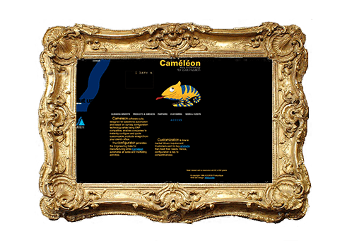
Looking back at the Caméléon website, we can see where WS was headed with its keen attention to detail.
The design was minimalist (as opposed to the chaotic sites of 1998 so prevalent). The branding stood out. The caméléon was animated with a subtle blink of the eye. A story was told through words in an animated Gif. It was truly engaging.
The black background added impact and differentiation.
The navigation was structured: the main bar with its attention to the product and service. The Contact and About Us menus on the left in an avant-garde fashion.
Even the menu bar, to offer an exciting mouseover effect was done painstakingly with images.
A strong brand identity, supported by a strong code. The html is lean and performant (while some things continue to stay the same…). One-level tables. Built in Notepad (…some things change).
Yes, though optimized in this case for the dominant 800 x 600 pixel resolution, we can see the desire to offer a somewhat responsive experience. Try it! You can certainly enjoy this site on your mobile today.

The content itself is written by web professionals, concise and keyword friendly, with links (some things refuse to change).
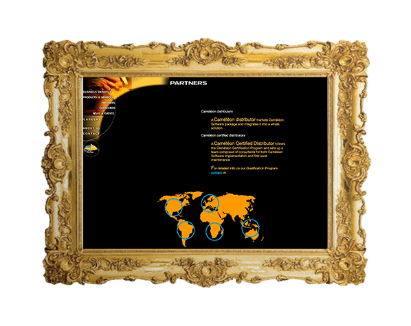
Each page tailor-made
The interior pages keep to the pace and offer easy-to-read yellow text on black background, and an image-map to navigate through-out the site. A call to action for the contact in neon-blue to convert users and meet the demanding KPI of our customer.
What would we do differently?
How about a quicker contact form to fill out? A little too much for today’s UX perfection.
But, as you can see, the email was not required. Some things certainly have changed. In fact, the phone number was not even required. What was our customer supposed to do? Write them a letter haha!
Well, yes, actually. It went into a wonderful MS Excel spreadsheet that had a mail merge macro and they could send their mailings that way. It worked!
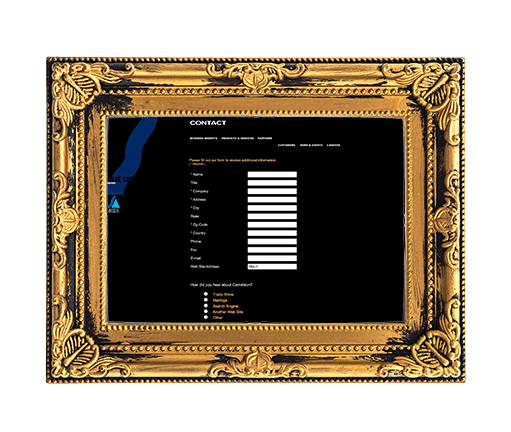
And no, that is not a bug on the menu, it was set to two rows for the responsive effect!
The site was a success and the rest as they say, is history!